Atmospheric Perspective Landscape Painting
| atmospheric_perspective_perspective_project_directions.doc |
|
Project 2: Atmospheric Perspective
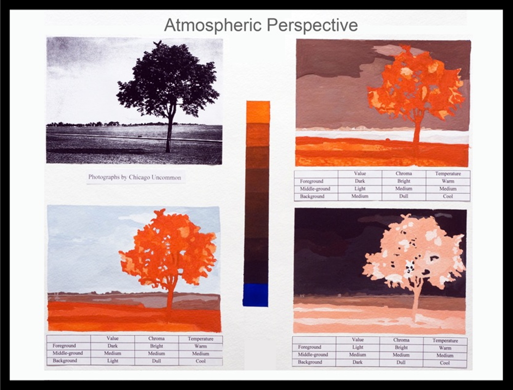
Objective: Explore the use of value, chroma, and temperature to establish spatial relationships 1. Select and Print a 4x6 landscape reference photo for the project. Be sure that it has a clearly defined foreground, middleground and background. |
|
2. Trace three identical outlines of a landscape composition on your paper keeping in mind that underneath each composition you will be adding a chart describing your use of value, chroma, and temperature. Make sure you have a distinct foreground, midground, and background. (You may use transfer paper)
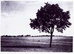
3. Choosing two complementary colors, mix both chromatic lights and darks, use white to tint, and the complement to darken and/or neutralize. This will be discussed in class for further directions and examples. Complete color swatches as examples of hues varying in value, temperature, and intensity to use within this project.
3. Choosing two complementary colors, mix both chromatic lights and darks, use white to tint, and the complement to darken and/or neutralize. This will be discussed in class for further directions and examples. Complete color swatches as examples of hues varying in value, temperature, and intensity to use within this project.
|
For this project, you will be exploring atmospheric perspective; a diminishing of contrast and color intensity as objects recede into the distance.
Look at your composition and imagine the distant objects as closer in value with less chroma (color intensity) than objects toward the front of the pictorial space.
You will now design the plan that will show how atmospheric perspective can be applied to three dramatically different value sequences, and how color temperature causes planes to advance and recede.
|
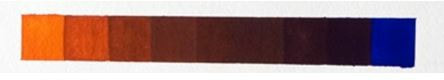
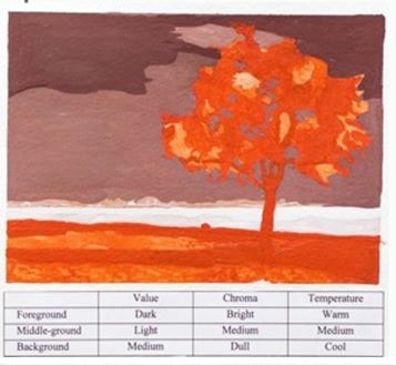
CHART 1: The first chart will look like this: By dulling the chroma and cooling the temperature of the background, (columns two and three) the atmospheric perspective criteria can be met; that of diminishing contrast. |
|
|
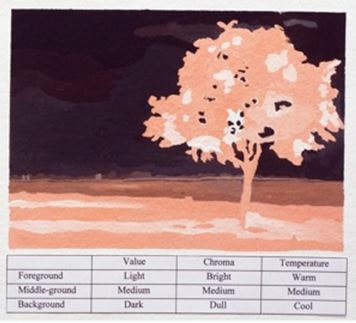
CHART 2:
Now make two other tables, keeping the order of columns two and three, but changing the order of column one, the Value Column. Instead of Dark, Medium, Light, change the order to Light, Medium, Dark. |
|
|
CHART 3: In the third table you create, change the value column order once again to Medium, Light, and then Dark. Using these plans, paint three studies, emphasizing the effect of atmospheric perspective. Notice the dramatic, emotional effect of the dark sky. |
|
